

Colour Drenching in Irish Homes. Where It Works, Where It Quietly Falls Apart, and the One Thing Nobody Tells You About Irish Light.
Colour drenching is one of those trends that looks unstoppable on Instagram and then behaves very differently once it moves into an actual Irish home.
I have watched it succeed beautifully. I have watched it fail quietly and expensively. And I have started to notice a pattern.
The colour drenching posts you see online are almost never shot in Irish houses. They are shot in London terraces with tall Georgian windows. In Copenhagen apartments with clean northern light on white timber floors. In New York brownstones with lamplight everywhere.
Meanwhile, you are trying the same look in a semi-detached in the Midlands, a bungalow in West Cork, or a new build in North Dublin — and something feels off.
It is not you. It is not the colour. It is not the paint.
It is the light.
I wrote a previous post on the colour drenching mistakes I see most often. If you have not read that one yet, start there — it covers the fundamental traps. This post is different. This one is about what actually happens when colour drenching meets an Irish house.
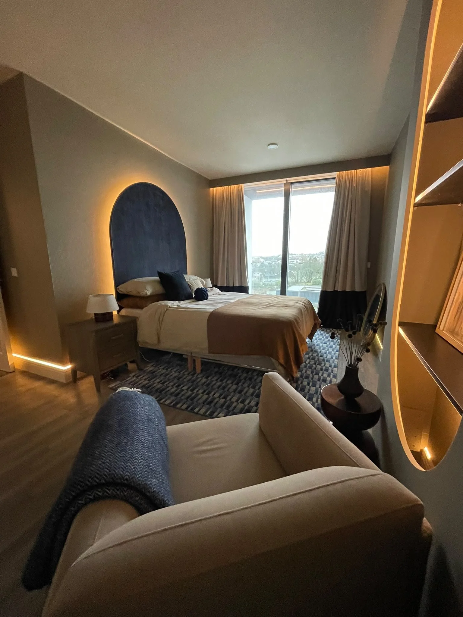
The Light Here Is Not The Light There
This is the thing nobody tells you.
Irish light is very particular. It is cooler than European light. It is softer than American light. It is greyer for more of the year than most people admit. And it moves through the day, changing the colour of your walls hour by hour.
That soft, misty, silvery light is the reason our countryside looks the way it does — beautiful and slightly wistful and unmistakable. It is also the reason a colour that looked stunning in a Farrow & Ball advertisement can read completely differently in your sitting room.
A warm terracotta that looks earthy and rich in a Notting Hill kitchen can look muddy and depressing in a Kerry cottage.
A deep forest green that felt jewel-like in a Manhattan powder room can start to feel heavy and cold in a Meath new build by November.
A soft sage that looked serene in a French apartment can turn slightly grey-blue in an Irish north-facing bedroom.
It is not that these colours are wrong.
It is that they were never chosen for our light.
That is the single biggest reason I see colour drenching fail in Ireland. People fall in love with a look photographed under someone else's sky, and try to recreate it under ours.
The Colours That Actually Behave Well In Irish Homes
After years of specifying colours across Limerick, Kerry, Galway, Clare, Dublin and Tipperary, a pattern has emerged.
The colours that hold up in an Irish room are almost always warmer than you expect, and slightly more muted than you think.
They have to work in November light as well as June light. They have to still feel good on a wet Wednesday afternoon when the sky has been grey since ten in the morning.
Warm, earthy neutrals. Mushroom. Warm stone. Soft putty. Farrow and Ball's Setting Plaster reads pink in the wrong light and blush-clay in the right one. Little Greene's Rolling Fog Mid holds beautifully in most Irish rooms. These are colours the Irish light does not fight.
Warm greens with brown or yellow undertones. Not cool sage. Not forest green. Warmer, dustier greens. Farrow and Ball's Card Room Green. Little Greene's Sage Green (theirs, not the trend name). These read as calm rather than damp.
Muted, foggy blues. Not navy. Not classic Georgian teal. Softer, greyer, warmer blues that have a touch of brown in them. Farrow and Ball's Skimming Stone through to Oval Room Blue. These sit peacefully in Irish light without turning cold.
Rich, warm browns. An underrated colour drenching choice, and one of my favourites for Irish homes. A warm brown room in an older Limerick house feels considered, timeless and unexpectedly modern. Farrow and Ball's Broccoli Brown or Little Greene's Attic II both work.
The colours that struggle most, in my experience? Cool greys, pure whites, and any pastel that leans blue. Under Irish skies, they can all quietly go flat.
The Ceiling Question, Answered Properly
Every colour drenching guide tells you to paint the ceiling.
Almost nobody tells you when NOT to.
Here is what I have learned.
Paint the ceiling the same colour when the ceiling is high, the room is well proportioned, and the room is used mostly in the evening. Dining rooms. Snugs. Bedrooms. Studies. The result is enveloping, warm, and quietly luxurious.
Paint the ceiling a lighter tint of the wall colour (usually mixed at 50%) when the room is smaller, the ceiling is standard height, and the room is used all day. Most Irish living rooms. Kitchens. Home offices. This keeps the cocoon effect without lowering the ceiling visually.
Do not paint the ceiling at all when the room has particularly beautiful architectural detail — an old cornice or exposed beams — that deserves to breathe. In those cases, a soft off-white ceiling picks the detail out and lets the wall colour do the emotional work.
The "always drench everything" rule is not a rule. It is a starting point. Real rooms need real judgement.
The Nugget Most People Miss. The Two-Direction Test.
This is the piece I promised.
Almost everyone will tell you to paint a large sample and look at it at different times of day. That is good advice. But it misses a crucial second step, and this is where a lot of expensive mistakes happen.
A room in Ireland almost never gets light from only one direction.
Even a "south-facing" living room in Ireland is really getting soft southern light through one window and cooler, borrowed light from a hall, another window, or a set of French doors on another wall. That mix is what actually determines how your paint will read once it is up.
So here is what I do, and what I would ask you to do before you commit to a colour drenching scheme.
Paint two large samples, on two different walls in the same room.
Not one. Two.
One on a wall that gets direct daylight, one on a wall that faces away from the light source. Then observe.
You will nearly always see the colour behave like two different colours. That gap between them tells you almost everything you need to know about whether the room can carry the drench.
If the two swatches feel like family — the same colour with different personalities — you are safe. Colour drenching will work here.
If the two swatches feel like strangers — one warm, one flat, one alive, one dead — the room is too complicated for a drench. You will end up with a scheme that looks wonderful on one wall and lifeless on the opposite one, and you will spend two years wondering why.
I have never once seen this test in a colour drenching guide. But it is the single most useful thing you can do before you commit to painting.
When Colour Drenching Is Absolutely The Wrong Answer
Sometimes a room does not need colour drenching. It needs something quieter.
A room with beautiful joinery, a strong architectural feature, a real view, or a lot of natural texture already has emotional depth. A colour drenching scheme on top of that can start to feel like putting a big statement necklace on someone already wearing a beautiful dress.
A room with a low ceiling and no real focal point does not need a drench. It needs light, layered lighting, better scale, and softness. The drench will make the room feel smaller, not more considered.
A room in a house where every other room is neutral will feel like an island. Colour drenching works best when the rooms around it hum in the same tonal family, even if they are quieter.
If your instinct is telling you the room needs "something bold to bring it to life" — that is often the room that needs restraint, not drama.
What Colour Drenching Actually Solves
At its best, colour drenching is not really about colour.
It is about giving a room a coherent, wrapped, and considered atmosphere in one confident move. It removes visual noise. It gives the eye somewhere to rest.
That is what makes a room feel calm.
Not the shade. Not the brand. Not the finish.
The sense that everything belongs.
Thinking About Colour Drenching Your Own Room?
If you are staring at a room and wondering whether it is a candidate — or whether you should walk away — usually the honest answer needs a second pair of eyes on the space, on the light, and on the furniture you already have.
That is exactly what I help with.
If you want a proper plan for the room rather than a costly experiment, the Confidence Boost package is where most women start. It gives you a colour direction chosen for your light and your home, not for someone else's.
And if you want to start with the mistakes to avoid, the previous post is here.
You do not have to guess. You do not have to gamble. You just need a clearer eye than the paint chart gives you.