

Spring 2026 Colour Trends That Lift Your Home (Without Regret)
Your home deserves colour that feels fresh now and still looks beautiful a few years from today. Spring 2026 is all about calm optimism: nature‑inspired greens, sun‑washed yellows, sky blues and soft fruit tones, grounded by warm neutrals. Below is a practical guide with simple steps, room‑by‑room ideas, and easy swaps so you can use these colours with confidence.
What’s In For Spring 2026
Honeydew greens and pistachio: soft, yellow‑based greens that feel clean and natural.
Terracotta and clay: warm grounding notes that add depth to pastels.
Soft coral and melon: cheerful but sophisticated, great for textiles and painted furniture.
Cloud and sky blues: airy, restful, brilliant with natural wood and nickel.
Lilac and periwinkle: gentle tints for bedrooms and baths.
Butter yellow: not neon; think creamy daylight.
Oat, mushroom and travertine neutrals: the new base that keeps everything calm.
A single bright bloom of colour (cobalt, poppy or emerald) used sparingly.
Fast palette cheat sheet (starting points; always test at home)
Honeydew green #DDECC4
Terracotta #C56E4F
Soft coral/melon #FFB195
Cloud blue #C8DCEC
Butter yellow #F4E2A1
Lilac #CBB9E6
Oat neutral #E8E1D6
Cobalt accent #2456B3
Note: Screens lie. Order large paint samples and view them in your light before committing! Never choose in the shop.
Five rules that make colour foolproof
Use the 60‑30‑10 balance: 60% neutral base, 30% secondary colour, 10% accent. Adjust to 70‑20‑10 in small rooms.
Match undertones, not names. If your neutral is warm (oat, mushroom), keep companions warm (butter, terracotta, honeydew). Cool neutrals pair better with cloud blue and lilac.
Test big and in corners. Paint two A4‑size swatches on different walls, two coats over primer. Check in the morning, midday and evening for 48 hours.
Light matters more than paint. North‑facing rooms make colours cool, while south‑facing rooms warm them. Choose bulbs 2700–3000K with CRI 90+ so colours render true.
Colour belongs on the details too. Painting skirting, doors and radiators in the same colour as the walls (or 50% lighter/tinted) gives a high‑end, cohesive look. This is super on trend these days, too.

The three hero combinations for Spring 2026
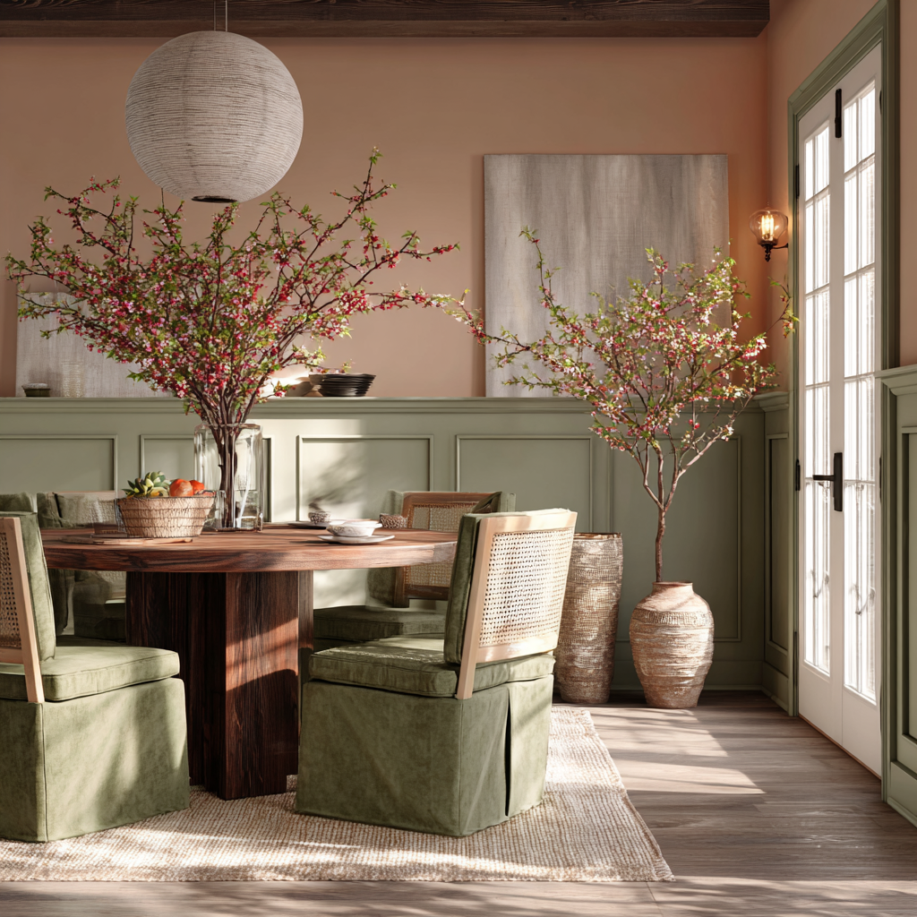
Honeydew Green + Terracotta Touches
Mood: fresh, organic, quietly cheerful. Pairs well with: oat/linen neutrals, travertine, oak, jute, matte black or aged brass.
Do this:
Living room: limewash or matte honeydew walls; terracotta velvet cushions and clay planters; oak and travertine coffee table; jute rug.
Kitchen: honeydew cabinetry or just the island; terracotta zellige splashback; unlacquered brass hardware; woven pendants.
Bathroom: terracotta hex floor; honeydew niche or vanity; black fixtures to sharpen.
Entry: beadboard in honeydew; terracotta umbrella stand; natural runner.
Avoid this:
Pairing with stark cool greys (it makes honeydew look sickly).
Overdoing terracotta. One to three touches are enough: lamp base, planter, runner.
Quick swaps:
Change a lampshade to pleated terracotta paper.
Use green‑toned botanicals and eucalyptus to echo honeydew without more paint.
2. Soft Coral/Melon + Cloud Blue.
Mood: breezy, optimistic, slightly coastal without being themed. Pairs well with: light oak, cane, polished nickel, linen, white plaster.
Do this:
Bedroom: cloud‑blue duvet or walls; melon stripe cushions; soft coral throw; pale oak bed.
Dining: cloud‑blue wainscoting; coral linen napkins; melon glassware; cane chairs.
Kids room: cloud‑blue ceiling; melon rug; coral canopy nook.
Patio: cloud‑blue cushions with a coral umbrella and melon pillows.
Avoid this:
Very dark woods that make the palette feel candy‑sweet. Keep timber pale.
Over‑saturated coral on all four walls. Use it on textiles or a single piece of furniture.
Quick swaps:
Paint one side table in melon.
Replace art mats with cloud‑blue card to tie the room together.
3. Neutrals, then a Bloom of Colour
Mood: calm foundation with one memorable note. Base: oat, mushroom, travertine, warm whites. Bloom: cobalt, poppy red, lilac, butter, or emerald.
Do this:
Living room: linen sofa, jute rug, travertine table; one cobalt lounge chair and a matching print.
Kitchen: warm white cabinets, taupe stone; butter‑yellow runner and a single coloured pendant.
Bedroom: greige walls; lilac headboard; neutral drapery.
Entry: plaster‑tone walls; buttery painted door as the welcome moment.
Avoid this:
Spreading ten different accents around. One bloom in two or three places is stronger.
Pure brilliant white trim with oat walls; choose a soft white so it doesn’t look chalky.
Quick swaps:
Change lamps to coloured glass (cobalt or butter).
Add a poppy‑red vase and repeat the colour once on a cushion.
Room‑by‑room playbook (copyable formulas)
Living room
Safe modern: oat walls + honeydew pillows + terracotta lamp + black framed art.
Colour‑forward: cloud‑blue walls + melon accent chair + pale oak + nickel.
Minimal bloom: mushroom walls + linen sofa + single cobalt chair + travertine table.
Kitchen
Budget update: paint the island honeydew; swap stools to terracotta leather; add woven shades.
Classic refresh: warm white cabinets + cloud‑blue tile behind the range + polished nickel.
Rental‑friendly: butter runner, blue ceramics on open shelves, melon tea towels.
Bedroom
Calm retreat: lilac upholstered headboard + oat walls + cloud‑blue throw.
Nature‑fresh: honeydew walls + terracotta ceramic lamps + flax linen bedding.
Small room trick: keep walls neutral and colour‑drench the wardrobe in cloud blue.
Bathroom
Spa note: white marble, chrome, pistachio towels and a melon striped blind.
Character: terracotta floor, honeydew vanity, matte black hardware.
Powder room punch: colour‑drench walls, trim and door in cloud blue; coral art.
Dining
Everyday pretty: cloud‑blue wainscoting + cane chairs + coral napkins.
Earthy: oat plaster walls + honeydew slipcovers + terracotta stoneware centrepiece.
Entry
Fast win: paint the inside of your front door butter yellow; add a melon runner.
Mudroom charm: honeydew beadboard, terracotta hooks, wicker baskets.
Patio/Sunroom
Resort feel: white wicker + cloud‑blue cushions + coral umbrella + melon pillows.
Mediterranean: honeydew bistro set + oversized terracotta planters + striped awning.

Lighting, undertones and finishes (small choices, big impact)
Northern light - cool colours; choose warmer versions of blue/green. South light warms; you may need to soften yellows.
Metal pairings: brass loves melon and terracotta; nickel flatters cloud blue; matte black anchors honeydew; copper is beautiful with clay tones.
Paint finishes: matte/eggshell on walls, satin on trim and doors, durable satin/semigloss on kitchens and baths. If colour‑drenching, keep sheen consistent across walls and trim for a tailored look.
Ceiling trick: paint the ceiling 50% of your wall colour or a barely‑there cloud blue to make rooms feel taller.
Patterns and textures that flatter Spring 2026 colours
Stripes and gingham in melon or blue feel current but timeless.
Cane, rattan, raffia and jute warm up cool blues.
Travertine and limestone love honeydew and oat neutrals.
Small checks and scalloped edges add a gentle, springlike finish.
Common mistakes that make colour look “off”
Picking paint from a phone screen. Always sample in your light.
Mixing “clean” pastels with “dirty” greige. Keep undertones aligned.
Using five accent colours in one open‑plan. Cap your whole‑home palette at 5 colours max: 2 neutrals, 2 main colours, 1 accent.
Forgetting the doors and radiators. Paint them into the scheme; don’t leave them brilliant white by default.
Buying cheap bulbs. Poor CRI makes every colour look wrong.
Budget‑friendly ways to try the trends in a weekend
Swap cushion covers, throws and lampshades (melon, cloud blue, honeydew).
Repaint a side table, console or inside of a bookcase in your accent colour.
Change art mats, frames or photo ledges to introduce or repeat a hue.
Add a runner, bath towels or a shower curtain in your chosen palette.
Plant herbs or olive in terracotta pots to echo warm clay tones.

Ready to try Spring 2026 colour without the overwhelm?
Save this guide and pick one room to start.
Order samples today and schedule a 30‑minute test session this week.
Keep the long‑term pieces neutral; use paint and textiles for the trend colour so changes are easy later.
Want personalised help choosing exact paint names and finishes for your light and layout? I offer a Colour Consultation that delivers a whole‑home palette, sample plan and a shopping list in one go.
Explore more design guides:
Join the community:
Follow on Instagram for daily colour pairings and sample tests.
Subscribe to the newsletter for weekly design tips.
Share your refresh with #Spring2026ColourWin
What room are you starting with, and which palette is calling your name—Honeydew + Terracotta, Coral/Melon + Cloud Blue, or Neutrals with a Bloom? I can map out exact shades and a shopping list for that space. - just DM me.